MK Design
The Professional Sign Consultancy Service
•Products•
Signs•System•Braille•Embossed/Tactile•Electronic•Bespoke •Architectural•Signs
•Services•
•Surveys•Audits•Plans•Drawings•Schedules•Pricing•Presentations•Seminars•Tenders•Training•

|
MK Design The Professional Sign Consultancy Service •Products• Signs•System•Braille•Embossed/Tactile•Electronic•Bespoke •Architectural•Signs
•Services• •Surveys•Audits•Plans•Drawings•Schedules•Pricing•Presentations•Seminars•Tenders•Training•
|
|
|
Please visit our new website by clicking on the following link:
Tactile/Embossed signs
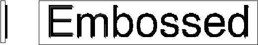
Embossed signs are essential for people with no sight or whose vision is only sufficient to locate a sign but not to distinguish individual characters. Because embossed signs take longer to read by touch, it is even more important that the messages should be concise, unambiguous and brief. Embossed signs are, by their very nature, always read close up and should be positioned where they can easily be touched. The ideal range of heights for positioning of embossed signs would be between 1600mm and 1300mm above finished floor level. Signs should be embossed, not engraved. The characters should be raised from the surrounding surface by between 1-1.5mm, and the thickness of each stroke of the letter should be such that both sides of the stroke can be felt with the finger in one pass. The minimum character height should be 15mm, although character height will vary between 15mm-50mm depending on space available, and the reading distance required. Inter-character spacing should be increased by between 20-30%, depending upon the chosen font to be used, and inter-word spacing should be increased by around 25%. The characters should not have any sharp edges, but must equally be clearly defined, by being slightly rounded or chamfered. A sans serif typeface should be specified. Particular care should be taken if specifying a typeface which include serifs.
Depth of embossing for text is 1-1.5mm Key Benefits
Contact Information
|
|
Last modified: August 2004 |